Less Is More
Today, luxury has been switched up in favour of something warmer and more comfortable. The result is luxury in its simplest form: the absence of fuss and complication.
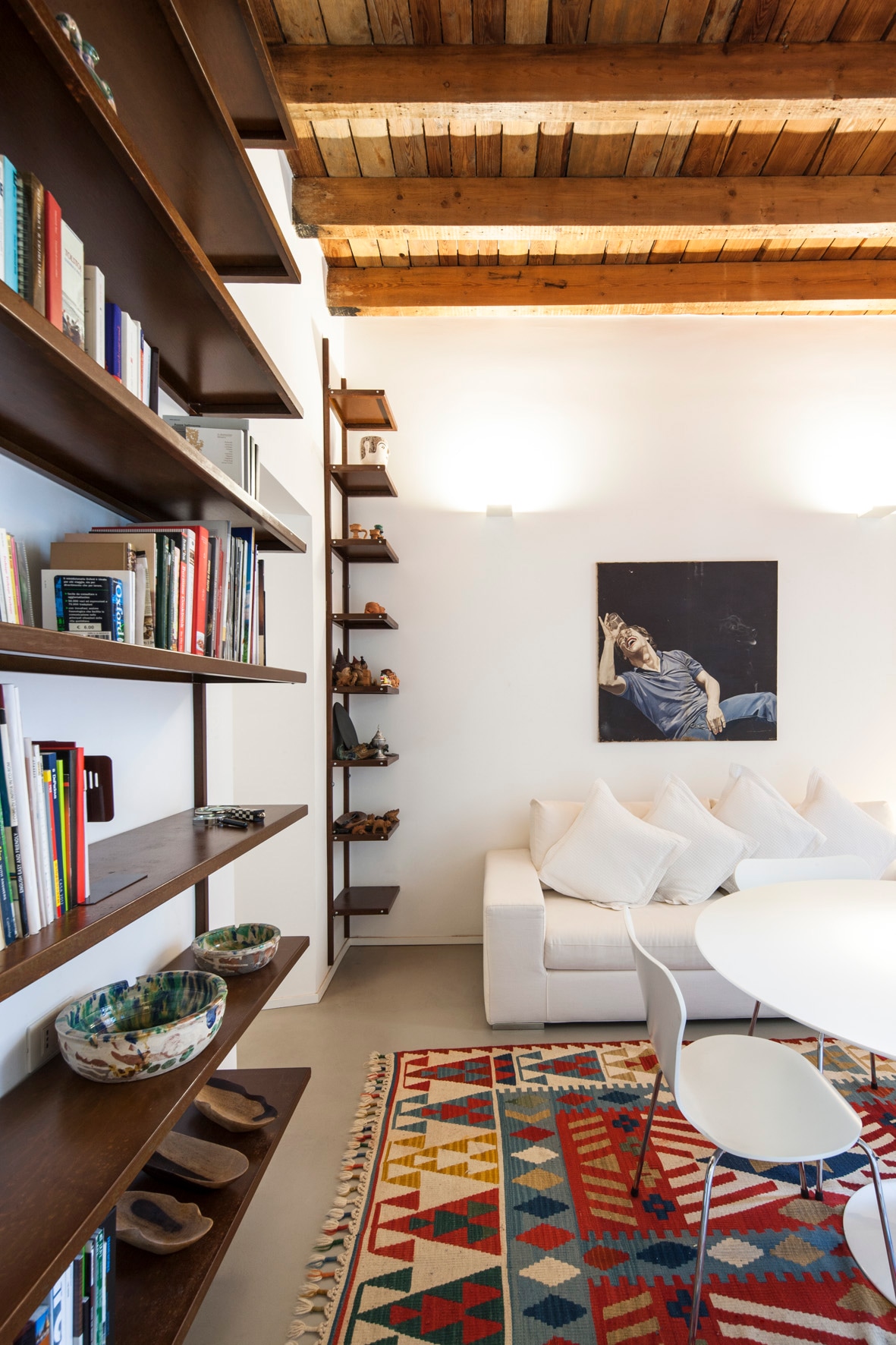
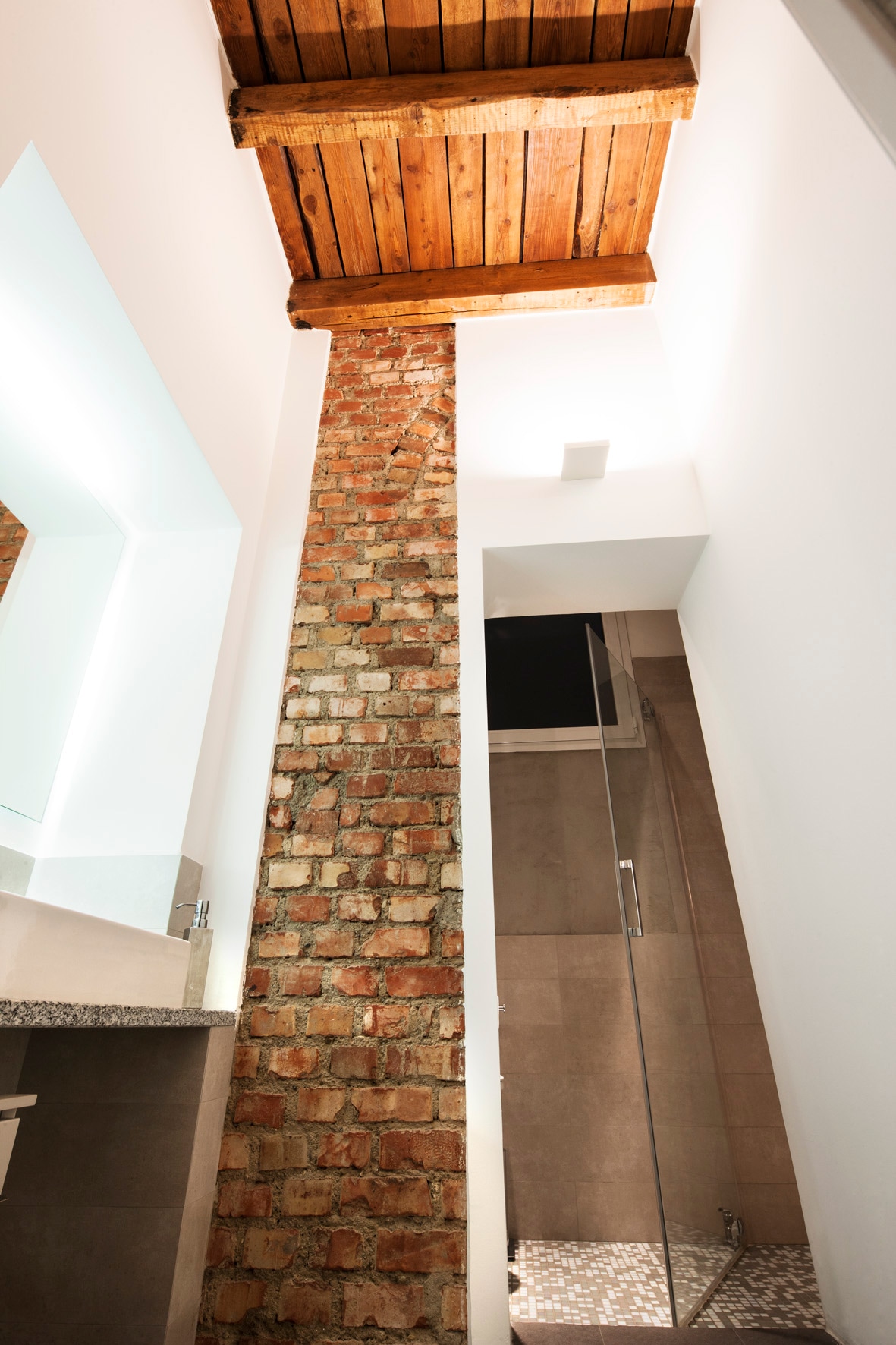
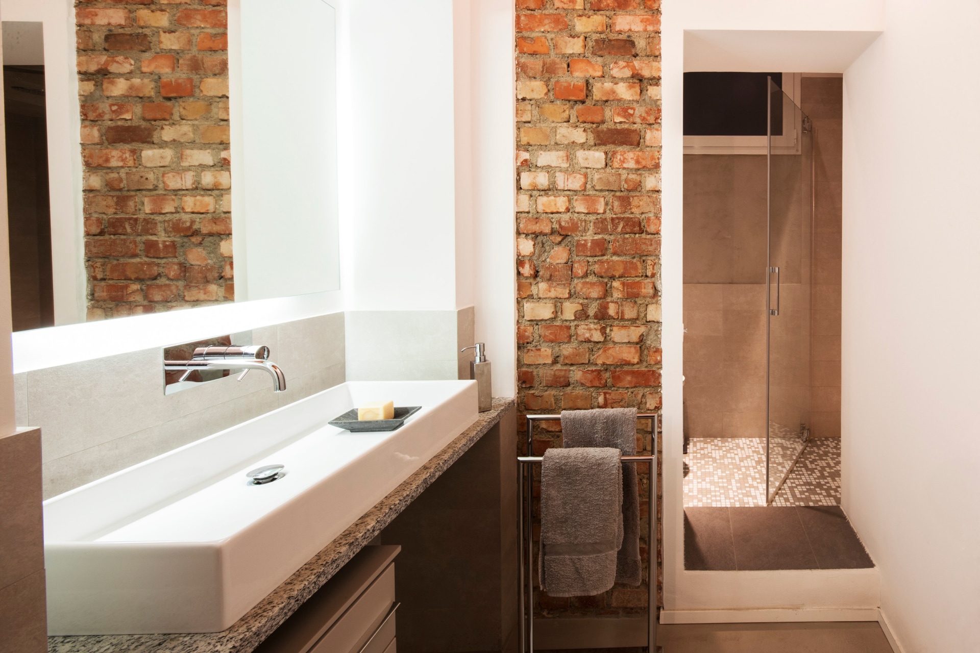
Drawing influences from an industrial character of warehouse conversions, the apartment features exposed brick, high ceilings and maximum design opportunities. Considered interior modifications had resulted in a mishmash of materials to highlight its beautiful bones.
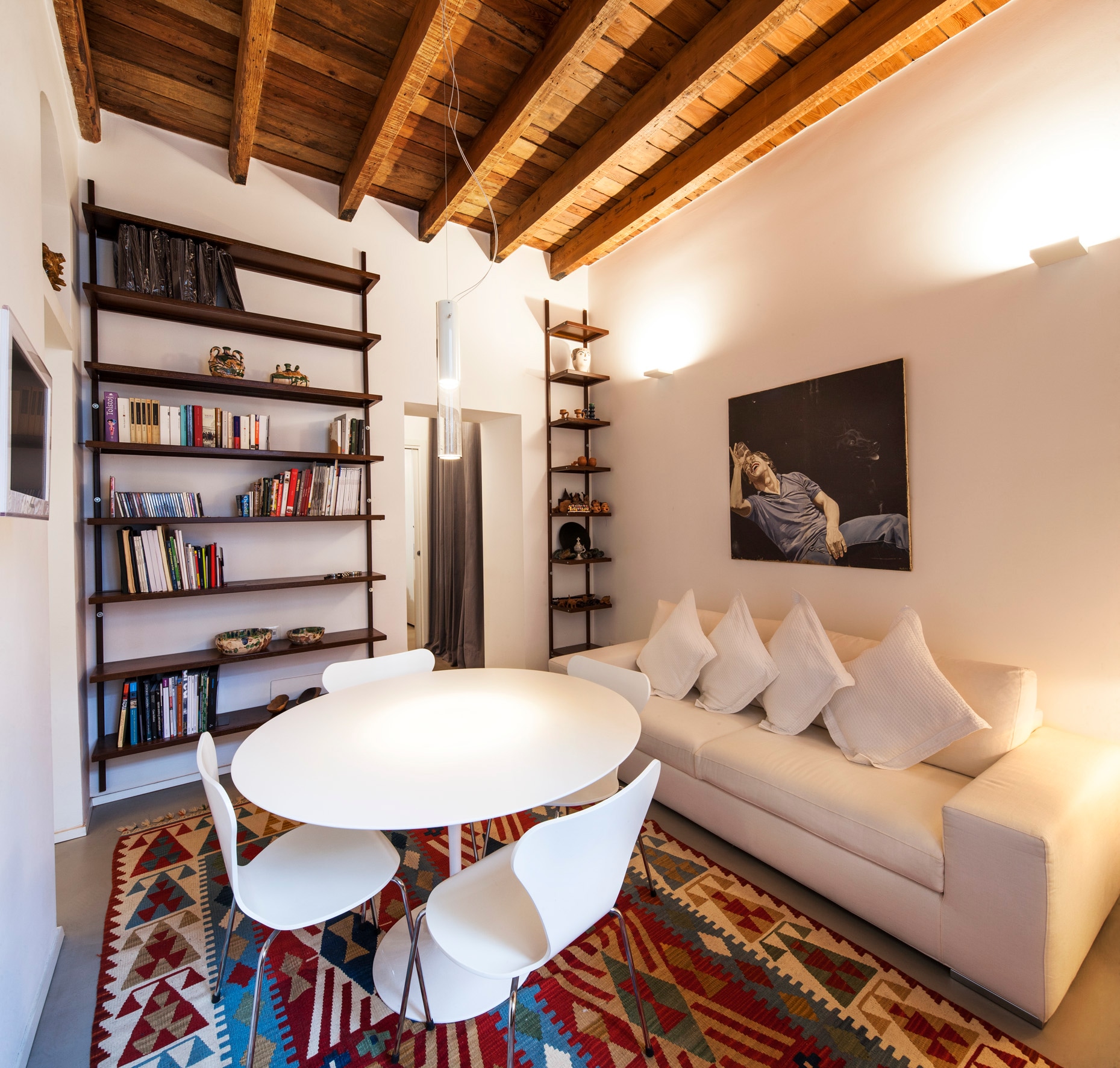
Low-key but high-end, the aesthetic may seem straightforward, but everything from the finishes to the flow has been carefully considered. Deceptively simple, the space is elevated into something more refined – whether it’s exposed beams above, chosen to maximise the space’s vertical height, or raw brick walls in the bathroom.
Throughout, the palette consists of subtle whites and creams, to balance the heritage of the property and its architectural bones. Black and dark wood tones are used on rows of open shelving, like punctuation marks against the palette of soft, tonal neutrals.
To inject interest into this restrained colour scheme, texture was key where the beauty of the design scheme lies in the obvious imperfections.
